Spanish brands have created memorable logos that transcend commercial borders, blending corporate communication with event branding to establish enduring visual identities.
Zara: Zara’s logo exemplifies corporate communication in fashion, with elegant typography representing affordable, quality fashion. At collection launches, it heralds new trends, showcasing the synergy between fashion and event branding. The most recent re-design in 2019 by the French agency Baron & Baron sparked widespread debate due to its overlapping letters and tighter spacing, a stark departure from its previous, more minimalist design. This redesign aimed to reflect the brand’s high-fashion aspirations.
SEAT: SEAT’s logo, known for its simplicity and geometric design, communicates modernity and sophistication. During new model launches, it draws public attention, illustrating how event branding enhances brand perception in a competitive market. The current logo, introduced in 2012, features a sleek and modern “S” with sharp lines, symbolizing the brand’s shift towards contemporary design and technology. This logo represents SEAT’s commitment to innovation and its connection to Spanish culture.
Telefónica: Telefónica’s evolving logo, with modern typography and vibrant colors, reflects innovation. At tech events, it emphasizes cutting-edge technology and connectivity, demonstrating the need for adaptable visual identities. The original 1924 logo was a simple, traditional design, while the latest version, introduced in 2019, features a dynamic and modern look. The vibrant blue and green colors and fluid design represent Telefónica’s commitment to connectivity and innovation in the digital age.
Camper
From Tradition to Trend: Camper, the Spanish footwear brand, has a logo that reflects its Mallorcan roots. The name “Camper” means “peasant” in Catalan, and the logo has a rustic feel, paying homage to traditional craftsmanship. Over time, it has maintained its rustic essence while adapting to modern design trends, symbolizing the blend of tradition and innovation.
Repsol
Dynamic and Energetic: Repsol’s logo, introduced in the late 1980s, features bold colors and a dynamic design representing energy and movement. The combination of orange, red, and blue symbolizes the sun, oil, and the sea, respectively, reflecting the company’s diverse energy portfolio and its roots in Spain
FC Barcelona
The logo of FC Barcelona, one of the most iconic in sports, has evolved while maintaining its core elements: the St. George’s cross, the Catalan flag, and the club’s colors. Each element represents different aspects of the club’s identity, including its Catalan heritage and sporting tradition. The motto “Més que un club” (More than a club) encapsulates its profound cultural and social significance.
These stories highlight how logos are not just visual identifiers but also carriers of rich histories, cultural significance, and strategic brand narratives.

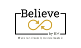
Our Logo:
- Black Color “Believe”: Symbolizes authority, sophistication, and seriousness.
- Gold Color in the Infinity Symbol: Represents success, achievement, and quality.
- Straight Lines Around: Structure and stability, indicating a solid foundation and a clear focus to achieve objectives.
- Infinity Symbol: The idea of unlimited possibilities and a continuous cycle of innovation and creativity.
What is the story behind your logo: tell us… J
We Believe in well-executed things.
We believe in unique, special, and tailor-made events.
If you can dream it, we can create it.